
How Colour Shapes The Mood of a Home. A look at psychology led design
Have you ever walked into a room and felt at ease without knowing why? More often than not, colour is playing a part.
Colour has a quiet but powerful influence on our daily lives. As an interior designer with a degree in psychology, I am always interested n the way colour affects our mood, behaviour and sense of wellbeing. I approach colour as more than decoration, it’s a tool for creating homes that feel calm and welcoming.
When colour is chosen with care, a home feels balanced and restorative, layered, timeless and comforting.
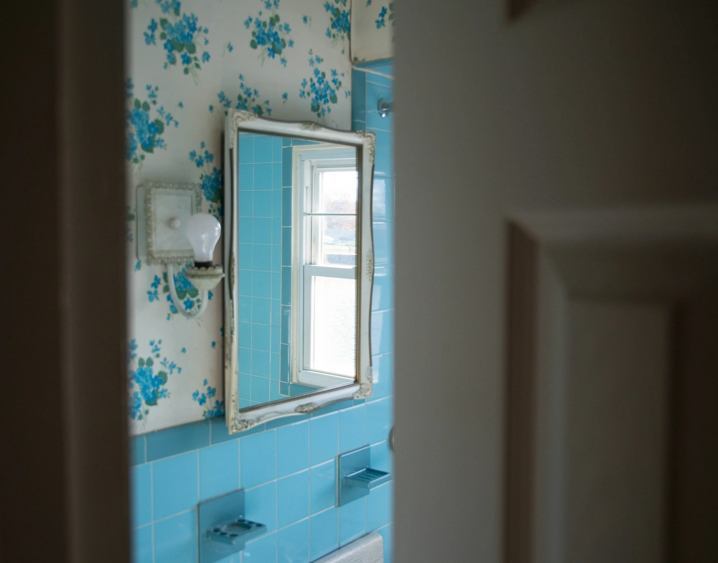
A sense of calm - Blues and greens have a naturally soothing effect, rooted in our psychological connection to landscape and nature. In bedrooms, bathrooms and drawing rooms, these shades help create a feeling of calm and gentle retreat which is perfect for spaces intended for rest and reflection.
My UK paint favourites are Farrow and Ball Mizzle, or Pale Powder. Little Greene Aquamarine or French Grey and Dulux Tranquil Dawn.
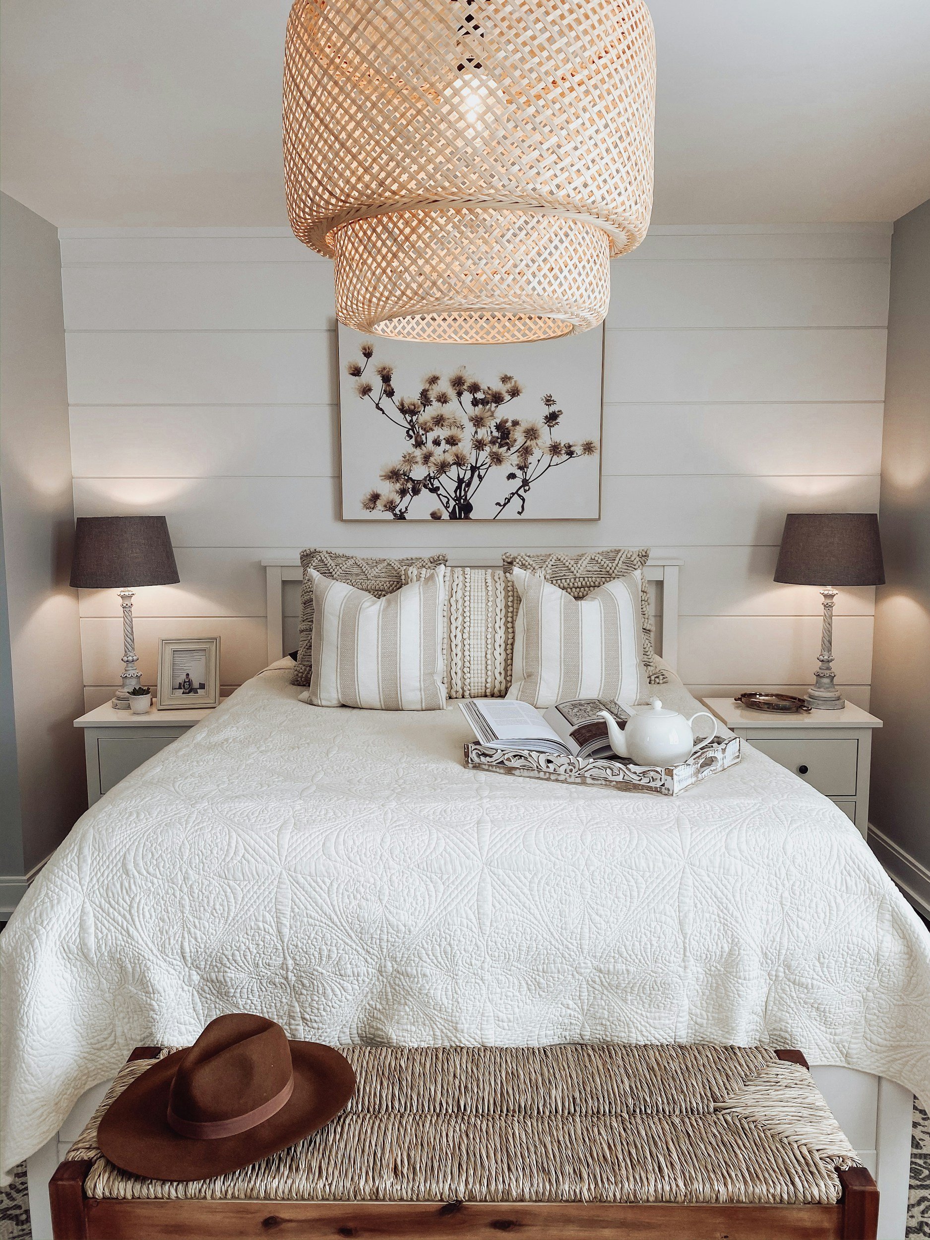
Safety and ease - Warm neutrals are often underestimated. Psychologically, neutral colours like soft stone, chalky whites and gentle greys, provide a sense of safety and grounding. In classic British homes, warm stone and putty tones create a soft backdrop that allows architectural details, antiques and natural textures to take centre stage.
My UK paint favourites here are Farrow and Ball Ammonite and Skimming Stone. Little Greene Rolling Fog and Dulux Egyptian Cotton.
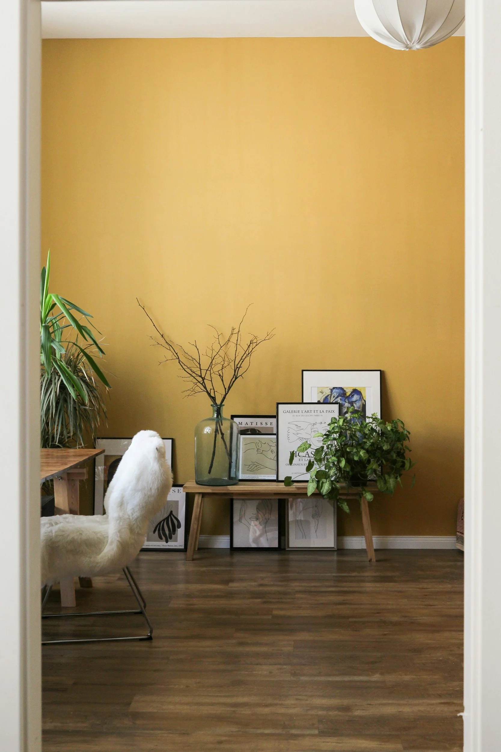
Warmth and welcome - muted yellows, ochres and earthy tones bring a feeling of warmth and optimism. They can lift the mood without overwhelming a space. These colours are particularly effective in kitchens, dining rooms and darker corners of the house. These shades echo candlelight, stone and aged plaster creating rooms that feel inviting and gently uplifting.
Favourite UK paints here are Farrow and Ball - Hay and Sudbury Yellow. Little Greene Giallo or Yellow-pink and Dulux Buttermilk.
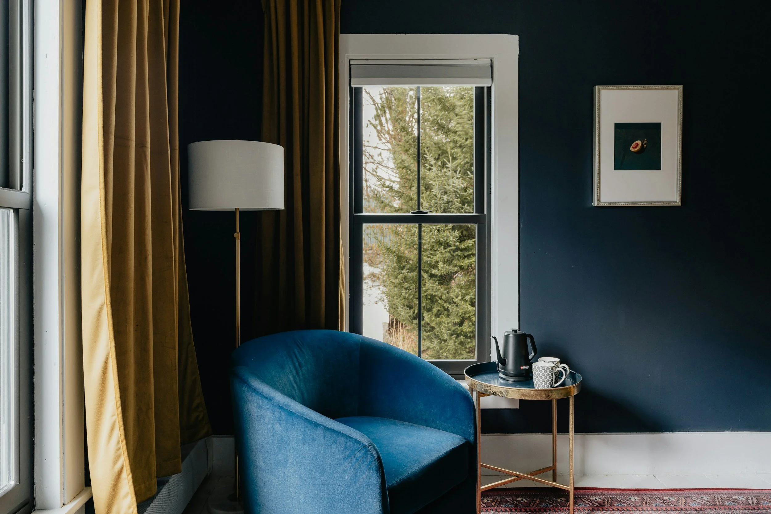
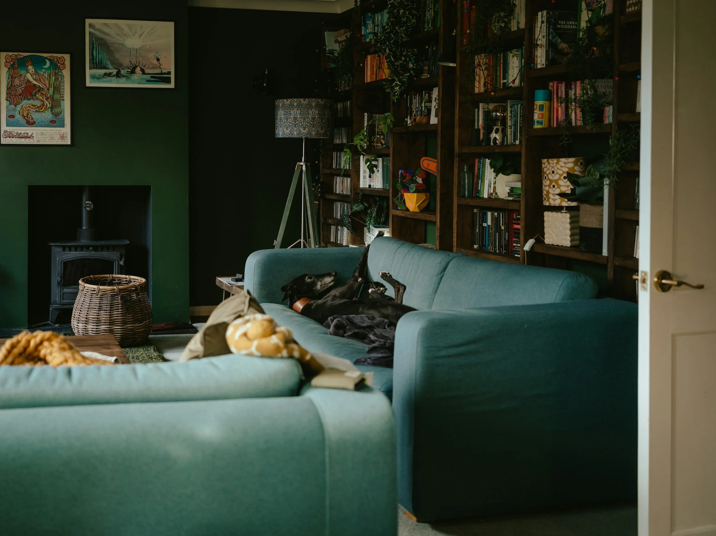
Comfort and containment - deep blues, rich greens and charcoals have long been used in libraries, studies and snugs. These colours create a sense of enclosure and security, making them perfect for rooms designed for evening use or quiet concentration.
Favourite UK paints are Farrow and Ball Hague Blue and Railings. Little Greene Obsidian Green and Crown paint Ink Well.
Colour when guided by psychology rather than trends becomes an essential part of how a home supports those who live in it.
In classic British interiors, it allows rooms to feel calm, characterful and quietly enduring.
If you’re considering reworking your home’s colour palette and would like a thoughtful psychology-led approach, rooted in classic British design, I’d love to help. Get in touch to discuss how we can create spaces that feel as good as they look.