
Four colours interior designers are using instead of grey
When I ask clients what colours thay have in mind for a room redesign, they pretty much always say, “not grey!”
For years grey dominated interiors, from cool-toned walls to silver furnishings, it became a safe neutral of choice. Recently though, designers and homeowners alike have been moving towards warmer, richer amd more characterful colours that create depth and personality within a home.
This shift is less about following trends and more about creating spaces that feel comforting,timeless and lived in, particularly in British homes where natural light tends to be softer and cooler.

Here are 4 colours that interior designers, including myself are increasingly asked for, and using, instead of grey.
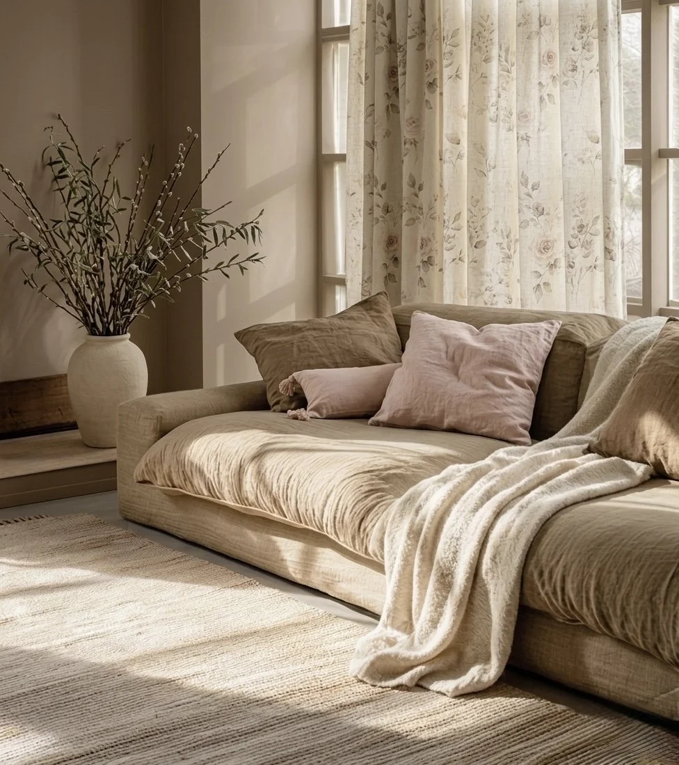
Olive Green - Olive green has become one of the most versatile modern neutrals. It works beautifully in both traditional and contemporary homes and pairs effortlessly with natural woods, brass and warm stone tones.
Unlike grey, olive brings warmth and softness while still feeling grounded and sophisticated.
Best used for: Cabinetry, Joinery, Living rooms and Snugs.
A couple of my favourite paints are Bancha by Farrow and Ball and Olive colour by Little Greene.

A design for a client based arond a sideboard painted in Bancha by Farrow and ball
Mushroom - Mushroom tones sit somewhere between taupe, beige and soft brown, creating a far warmer alternative to cool grey walls. These earthy neutrals work especially well in British interiors, because they adapt beautifully to changing daylight throughout the day.
Pair these with linen, walnut, aged brass and soft creams.
My favourites are London Stone by Farrow and Ball or Jitney for a darker soft brown. Mushroom by Little Greene is a classic warm neutral beige.
Pale pink - Soft blush and pale pink tones are becoming a sophisticated alternative to cool grey interiors. Far from feeling overly sweet, muted pinks add warmth, softness and a subtle glow that works beautifully in both classic and contemporary spaces.
When paired with natural textures and earthy materials, pale pink creates rooms that feel calm, elegantnand inviting.
Ideal for: Bedrooms, sitting rooms, hallways and soft furnishings.
My all time favourite pink is Setting plaster by Farrow and Ball. It looks beautiful in all lights but more pink in sunny rooms. Paint & Paper Library also do a fabulous pink called Rose Cluster.
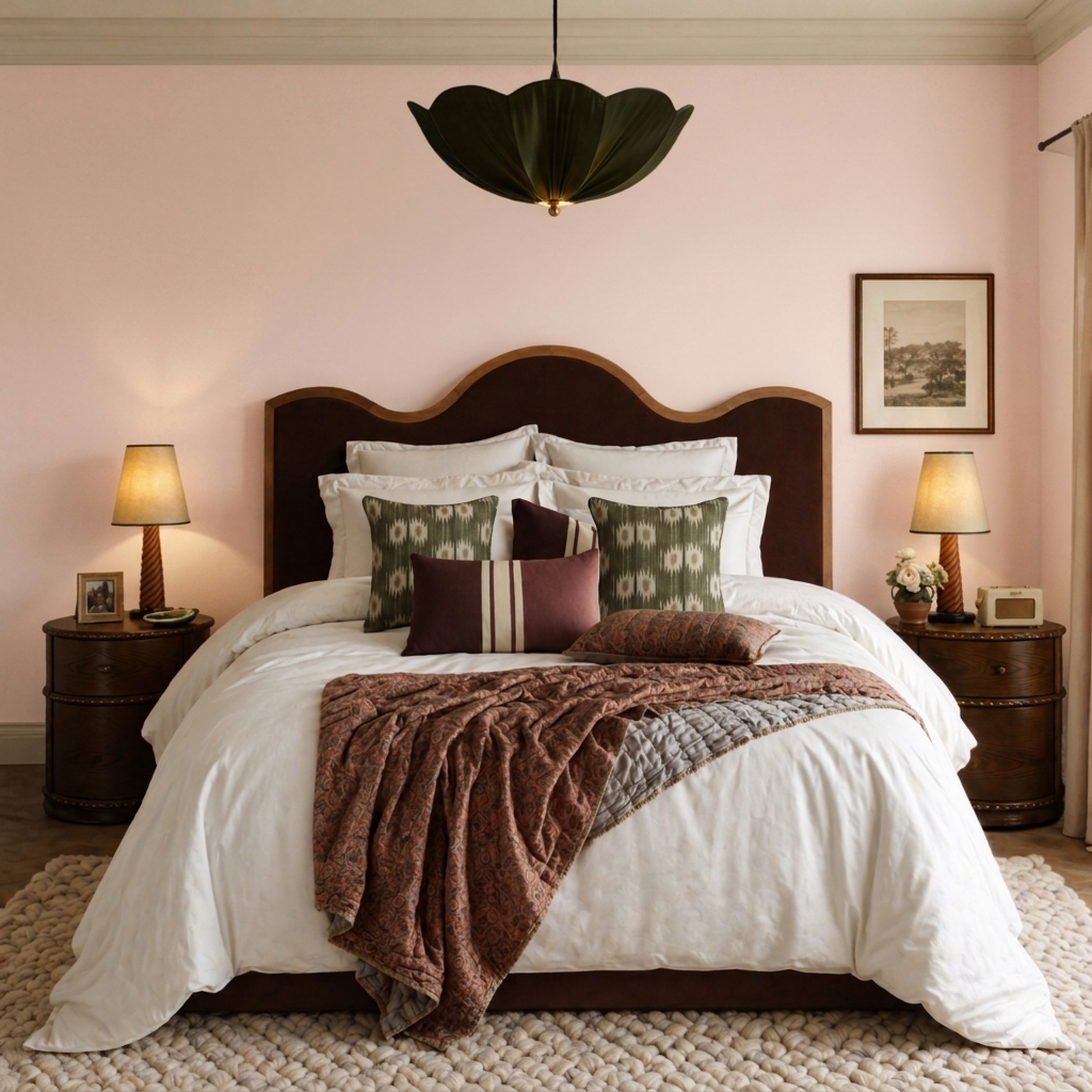
A design for a client’s bedroom based around Farrow and Ball Calamine
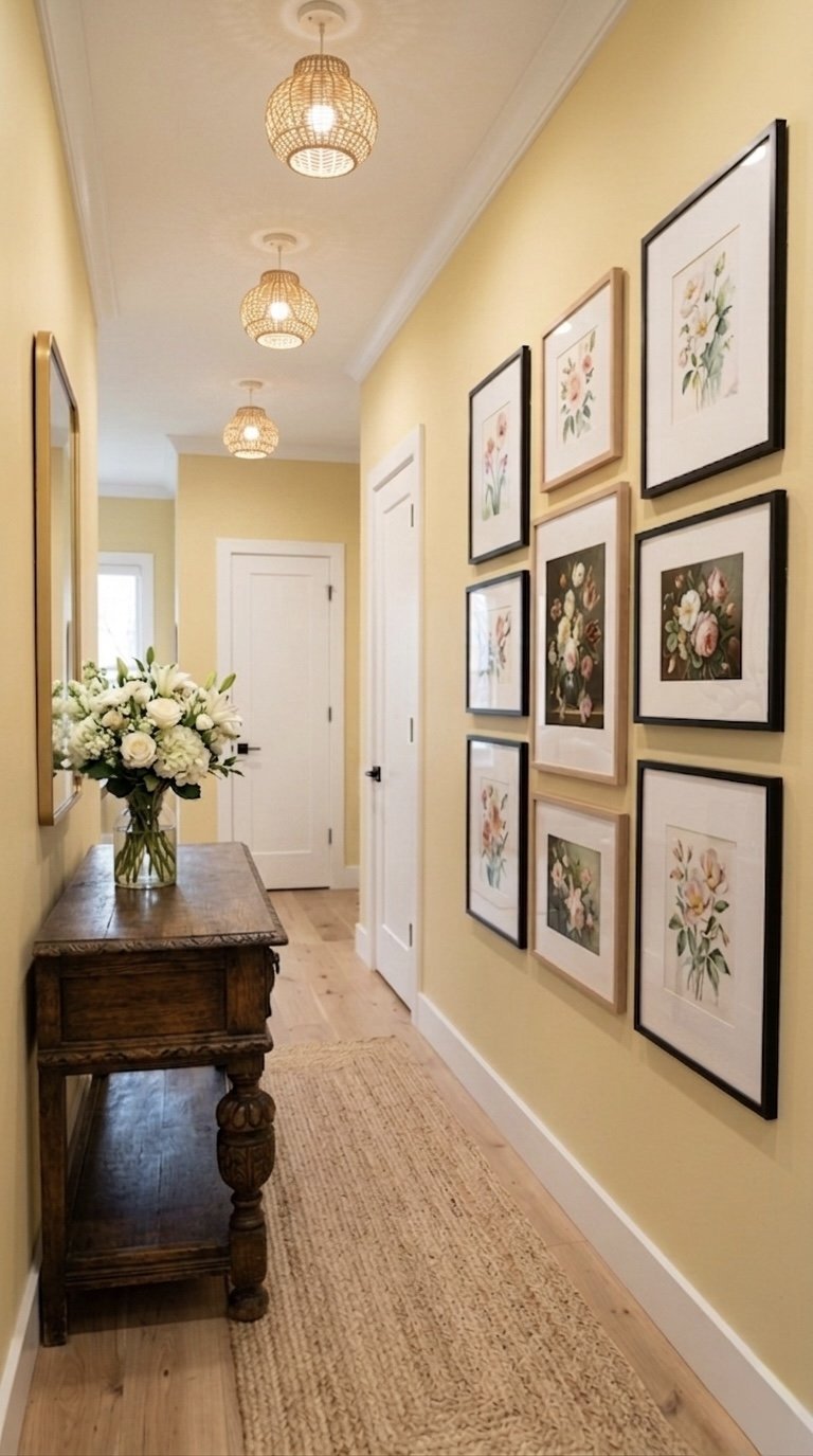
Buttery yellow - Soft buttery yellow has become one of the most sought-after shades in modern interiors. Warmer and more subtle than bright yellows, it adds a gentle warmth and light without overwhelming a space.
Interior designers are increasingly using buttery yellow to create upliftong rooms that still feel elegant and timeless.
Best for: kitchens, breakfast rooms, hallways and soft furnishings.
My favourite yellows are Hay by Farrow and Ball and Indian Yellow by Little Greene.
Grey will always have it’s place, but interiors are becoming warmer, richer and far more layered. The most timeless homes now focus less on “safe” neutrals and more on creating atmosphere through colour, texture and personality.
If you’re unsure where to begin, start by introducing one warmer tone alongside your existing palette and build gradually from there.
Creating a home with warmth and character starts with thoughtful design. I help homeowners create warm, cohesive interiors that feel timeless, personal and beautifully balanced.